Revamping the Workflow Module – A Case Study
Introduction
Creating intuitive and scalable interfaces is key in the enterprise software 
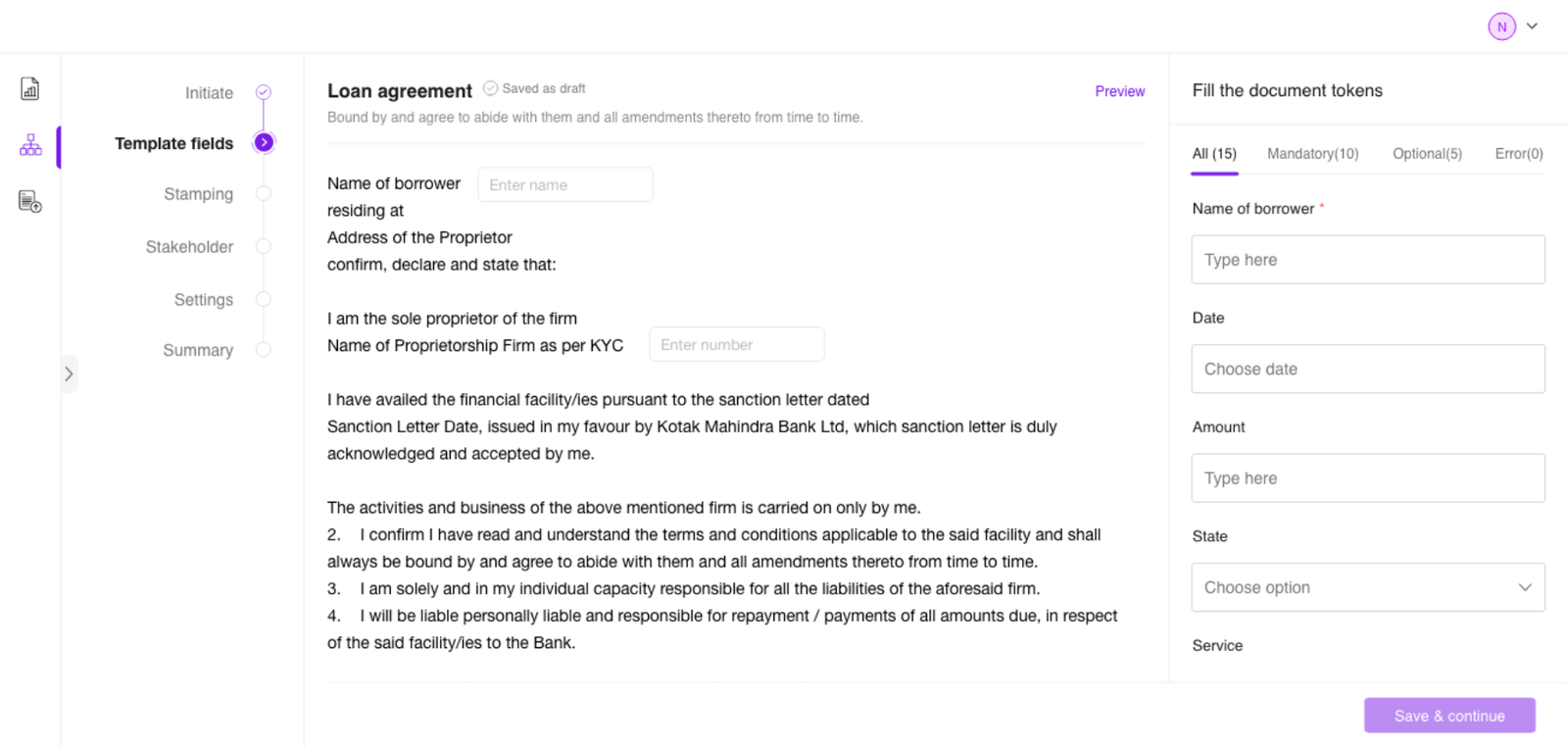
space, especially for legal-tech platforms that support complex workflows. This case study details the UX revamp of a Workflow Module for a SaaS product used by top BFSI clients, aimed at improving the user experience for operations managers, compliance teams, and product admins.
My Role:
Product Design - user research, visual design, interaction design
Team:
Product Manager, 4 Developers, 2 Designers
Timeline:
5–6 months
Tools:
Figma, XD
Problem Statement
The legacy workflow module had significant UX issues:
Forced Defaults:
The “Upload” option was pre-selected, limiting visibility and choice for users who preferred the Template flow.
Cognitive Overload:
A dense, all-encompassing UI presented excessive information at once, confusing users.
Lack of Progress Indicators:
Users were unable to track their progress within the workflow, creating uncertainty and frustration.
High Support Dependency:
Errors due to the unclear interface led to frequent support queries, increasing operational inefficiencies.
Our objective was clear: to redefine the experience by simplifying the user journey, improving task completion rates, and reducing user error.
Old vs. New Workflow Comparison
Forced Defaults After (Revamped)
Pre-selected Upload flow Clear distinction between Upload and Template flows
All content presented on one screen Streamlined, 7-step guided modular interface
Document preview always visible Preview shown only when signature placement is needed
No review or summary functionality Final summary screen for user verification before submission
User Research & Insights
Our user research was pivotal in informing the redesign. Through direct interaction with operations managers, admins, and compliance officers, we gained valuable insights into their workflow challenges and needs.
Methods:
Interviews
Conducted with 8 users across different roles (Ops Managers, Admins, Compliance Officers)
Usability Tests
Observed users as they navigated the old workflow, employing a think-aloud protocol
Surveys
Gathered post-session feedback to measure satisfaction and identify pain points
“I didn’t even know Template was an option because Upload was always pre-selected.”
— Priya Sharma, Operations Manager
“I felt like I was skipping something. It was hard to track what I’d completed.”
— Rohit Menon, Product Administrator
“I only need the document when placing signatures. Otherwise it’s just visual noise.”
— Anjali Verma, Compliance Officer
Key Insights:
Visual Clutter
Users were overwhelmed by too much information displayed at once.
Guidance Needed
Users frequently missed steps or made errors due to lack of clear guidance.
Lack of Progress Visibility:
Without a way to track progress, users felt uncertain and anxious during task completion.
User Personas & Pain Points
Persona Persona Pain Points Goals
Priya Sharma Ops Manager Confusing labels, no back-navigation Speed, accuracy, and clarity in execution
Rohit Menon Product Admin Limited visibility into workflow options Ease of use, reusability, and transparency
Anjali Verma Compliance Officer No audit trail, excessive clutter Compliance, traceability, and clarity
Sameer Khanna Branch manager No validation before publishing hAccuracy and smooth executionhh
User Journey Map
Concise and Clutter- free Straight-forward approach Can be more visually appeling Number of fields can be reduced Pre-filling the details would be easier Multi level approach Visually appealing Meets expectations Predictable & Consistent Intuitive & Informative User-centric & Ease of use Meets expectations Heavy & Information rich Aesthetic & Conventional Well-organized Well-optimized Thoughtfully planned Initiate Template filling Stamping Stakeholoder Settings Signature position Summary
User flow
Upload Select template Token filling Start Initiate Signature position Stamping Stakeholder Setting Summary End Signature positing Yes No
Upload Select template Token filling Start Initiate Signatureposition Stamping Stakeholder Setting Summary End Signature positing Yes No
Initiate
User selects either Upload or Template to start.
Template filling
Enters token values (if template) or proceeds directly (if upload).
Stamping
User attaches a digital stamp paper, if required by the document type.
Stakeholder
User adds signers, reviewers, and approvers, assigning roles and permissions.
Settings
User defines workflow preferences like signature block drag and drop, document expiry, and reminders.
Signature position
User previews the document and drags signature blocks onto it.
Summary
User gets a final overview and publishes the workflow.
Design Solution & Process
Design Principles
Aesthetics
A polished UI enhances trust and reduces friction.
Gestalt approach
We use Gestalt principles for intuitive, coherent components.
Light cognitive load
Clear choices and structure enable effortless decisions.
Visual hierarchy
Contrast, size, and spacing improve focus and scanning.
Consistency
Predictable patterns accelerate learning for seamless UX.
Adaptability
Components evolve to support new cases with consistency.
Information Architecture
Through card sorting and tree testing, we refined the information architecture, improving the usability score from 60% to 85%. The final structure consisted of:
Left: Stepper for navigation
Center: Main canvas for user input
Right: Context panel for settings and help
Wireframes & Prototypes
Prototypes were iterated from sketches to high-fidelity mockups in Figma. Each prototype incorporated real data and micro-interactions to simulate the live environment:
Early wireframes validated user flows.
High-fidelity prototypes were conditionally interactive to mirror real scenarios.
Usability Testing
Each iteration was subjected to rigorous usability testing to uncover potential flaws and refine the experience:
Round 1: Focused on improving the navigation logic and workflow progression.
Round 2: Tested the signature flow and preview functionality.
Visual Design
The final visual design adhered to an enterprise theme with a clean, minimal aesthetic. We also ensured that the design was accessible:
WCAG AA compliance for color contrast and readability
Full keyboard navigation and screen reader support
Key Improvement
Structured step-by-step navigation to reduce confusion and cognitive overload.
Introduction of conditional document preview to only display when necessary.
Final summary screen for increased user confidence before publishing.
Optimized backend logic for system efficiency and reduced errors.
Design Impact
Metric Before After Impact
Task Success Rate 60% 95% ↑ 35%
Support Tickets High Low ↓ 60%
Usability Score (SUS) 55 85 ↑ 30 pts
Final Outcome & Learnings
The revamped workflow module was successfully launched, addressing user pain points and improving operational efficiency. The system’s scalability has paved the way for future extensions to other modules.
Key Learnings:
Simplification of complex processes is essential for usability and system adoption.
Progressive onboarding significantly reduces errors and builds user confidence.
Aligning design with backend architecture ensures a seamless, scalable solution.
“I finally feel in control when setting up workflows. It just flows now.”
— Priya Sharma, Operations Manager